Thumbing through a favorite dive magazine, you can’t help but notice that a good number of the feature stories open with a two-page spread that uses a single large image that is overlaid with the feature’s title and the story’s opening text.

Above is a sampling showing four different Scuba Diver Magazine spreads that I had written for this publication.
What do all these images have in common? They all have varying degrees of neutral space to one side or the other for dropping in title, headers and text. Art directors love this type of composition because it leaves the right amount of exploitable space.
While most of my underwater photography might not win or place in a photo contest, to shoot imagery for publication purposes is still an art form all its own; not to mention a little profitable as well when you get it right.
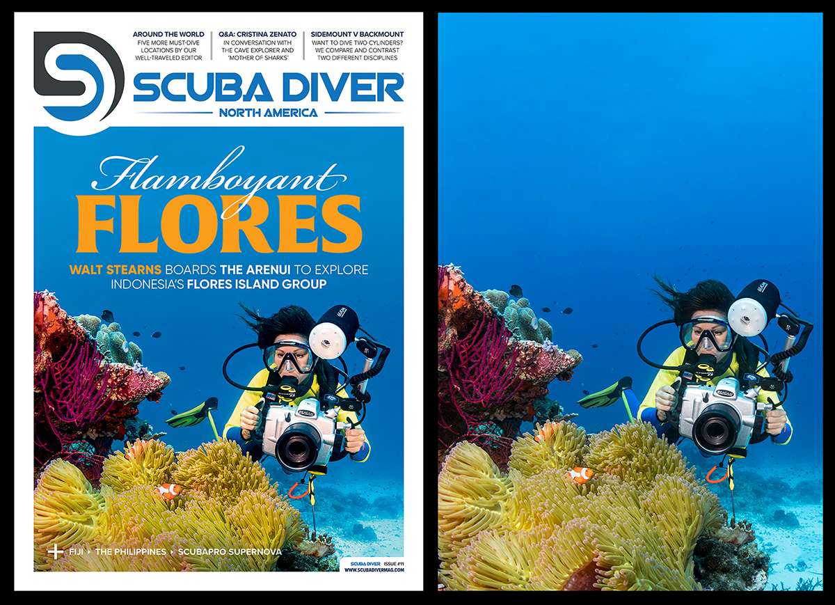
For example, the image used for this cover shot of a underwater photographer looking at a large anemone with a pair of false clown anemonefish only had to be cropped slightly at the top to fit the layout. Even with that done, the art director still had more than ample space above the main scene for the feature story title and subheadings.
Mechanics of Adding/Applying the Rule of Space in Photography Explained
If you research the topic of making active use of space in a photograph, you’ll run into a litany of terms that include Positive Space, Empty Space, Dead Space, Negative Space and Active Space.
For all practical purposes Empty Space and Dead Space are just as they sound. Some texts denote empty space as white space, whereas dead space is essentially unused empty space that does little to nothing to convey any of the images’ story telling elements. In general, a large empty space with a uniform single-color color background can leave an image looking unbalanced and unfinished, but there are also ways to exploit that space which we will get into a bit later. Some quick examples include the turtle image mentioned before and the deep black background you get on a blackwater dive. For art directors, an upside of a uniform background is the ease of cloning additional peripheral spaces to create appropriate space for adding text.
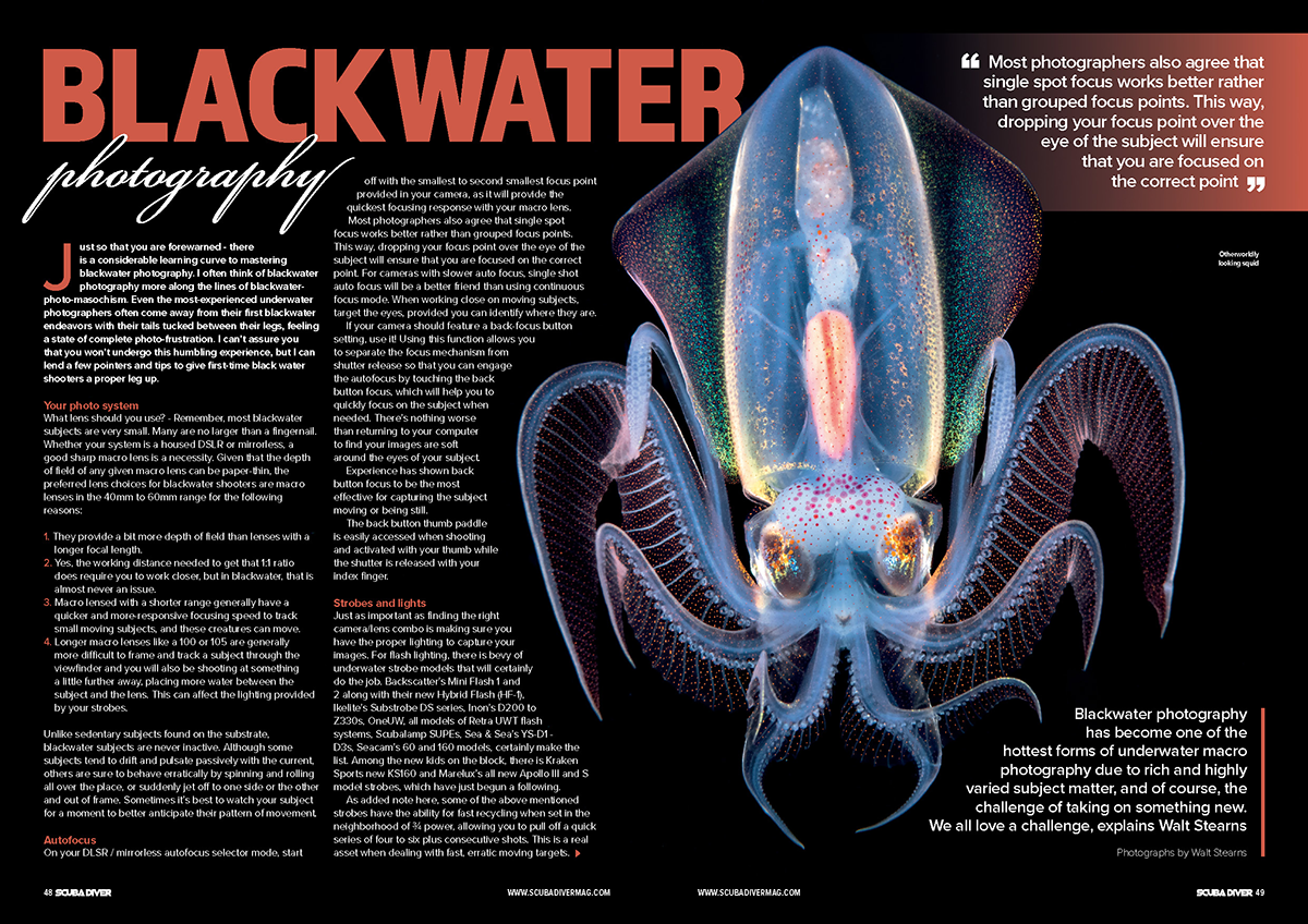
A good example of Dead Space in action is this two-page opening spread on Blackwater Photography for Scuba Diver Magazine’s North America Edition, issue 22, featuring my image of a Diamond squid taken on a blackwater dive. Since the squid had an all-black background it made it easy for the art director to add addition amount of black space to the left of the squid to provide enough space for placement of both the story’s title and bulk of the story’s text right up front.
Following Empty and Dead Space is Negative Space.
Unlike Empty and Dead Space, Negative Space has a more integral function in how it relates to Positive Space within a picture.
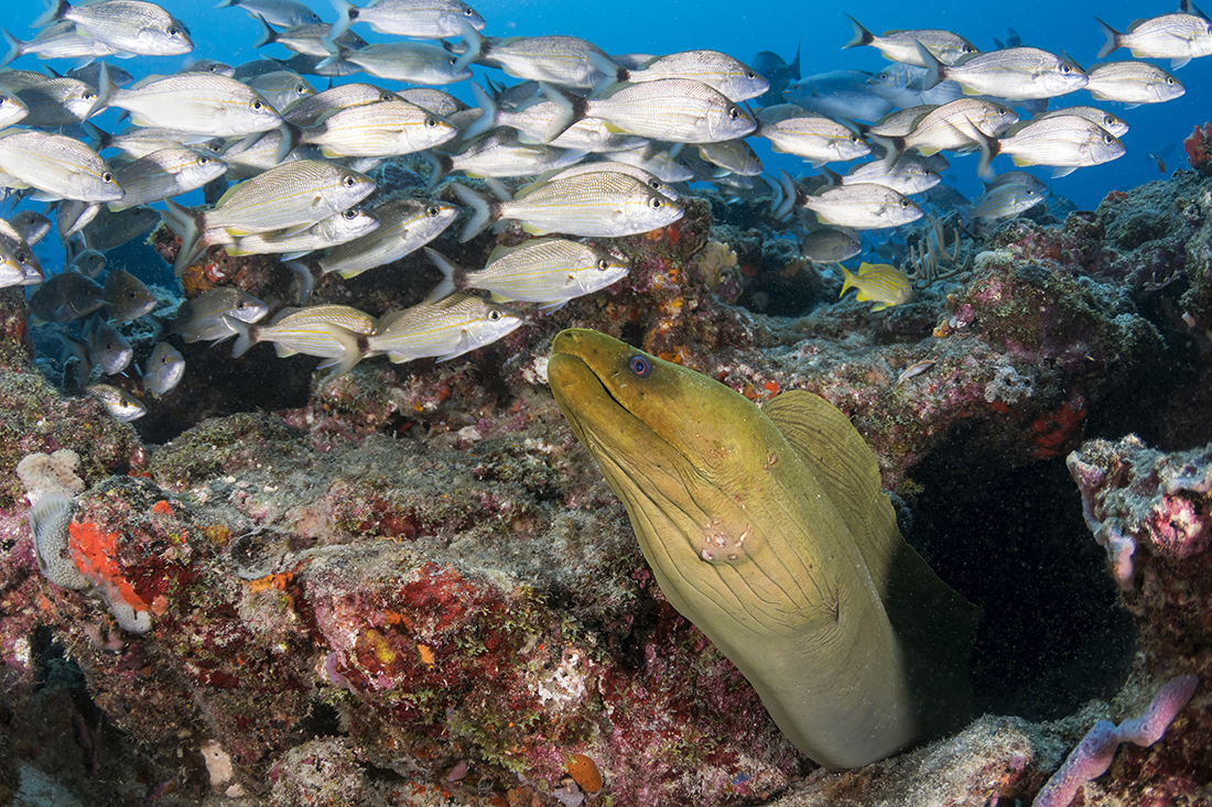
Positive Space is the actual subject in the picture. In this case, the large green moray eel in the foreground is the first thing the eye is drawn too – defining the image’s region of Positive Space. From there your eye is drawn to the school of fish and the reef around and behind it. This region of the image is referred to as Negative Space. The purpose of Negative Space is to help emphasize the subject matter, drawing the eye first to the front occupied by the eel, then within the frame while at the same drawing the eye to the background; thus, the photo presents a greater sense of dimension.
However, with that photo I admit that it sits on the threshold of having too little negative space. If I had tightened the composition anymore, I would have run the risk of having it turn out overly cluttered and busy with every element in the photo screaming for the viewer’s attention like it would with this one below.
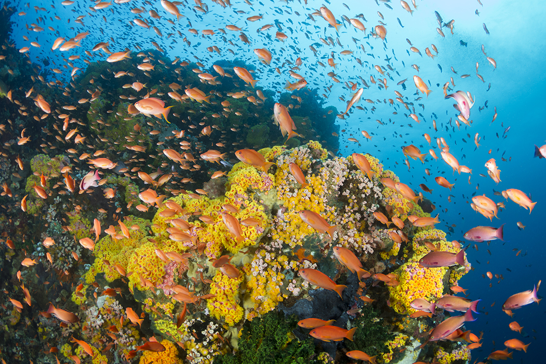
Yes this shot of a cloud of orange anthias is certainly colorful and dynamic, but your eye will likely have trouble deciding what part of frame to start with first. The reason for leaving a sufficient amount of Negative Space surrounding the subject is to provide breathing room for your eyes.

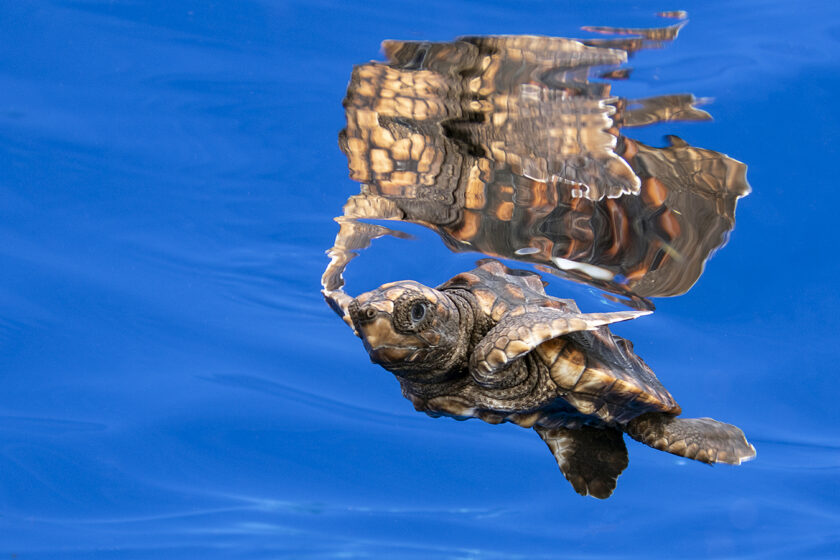
Now, we are back to the baby turtle swimming in the blue used for the header of this column. Compared with the shot of the eel, the space reserved to show the water column around the turtle is larger. Incorporating this much Negative Space is a minimalist tactic in photography to train your eye on the Positive Space that is actually the turtle within the frame. But that’s not all. Those who understand the Rule of Thirds will also see that the turtle’s position is more in the lower right third of the frame leaving the remaining two thirds more open to provide a sense of space.
In doing so, I have taken the principles of “Negative Space” a few notches higher by deliberately arranging visual elements in such a way as to create the appearance of motion to the turtle with a destination in mind. In short, I have created a region of “Active Space” to provide greater impact of the uncertainty of the tiny creature’s future as it begins its journey in a very big ocean.
When dealing with a subject that is actively moving or looking/facing a specific direction, ideally you want to have space in front of the subject to help establish a sense of motion and/or anticipation. Without Active Space, your primary subject will have less impact to the story you want to convey in your picture.
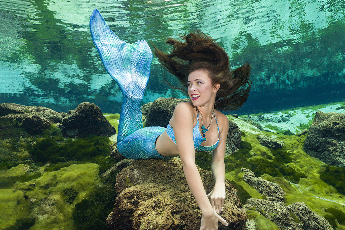
In this portrait of a mermaid at Weeki Wachee Springs, her gaze is off to her right. By leaving more Negative Space to the direction she is looking it is now more Active, creating a sense of anticipation which is further channeled by her expression as to what lies to the left outside the frame.
Less is More
One of the more common mistakes is overcrowding the frame. Too many elements within the frame can easily overwhelm the viewer to the point of weakening the impact of the image. You don’t want the Negative Space to steal the show, but rather have it aesthetically enhance the image.
Backgrounds play a highly important role in an image. Often more so than people give it credit for. A good rule of thumb to achieve the right effect during composition is to allow for Negative Space to take up at least 50% of the image. At the same time don’t ignore what is going on in the background. A background that is cluttered can distract, while a simpler one adds depth and positive space
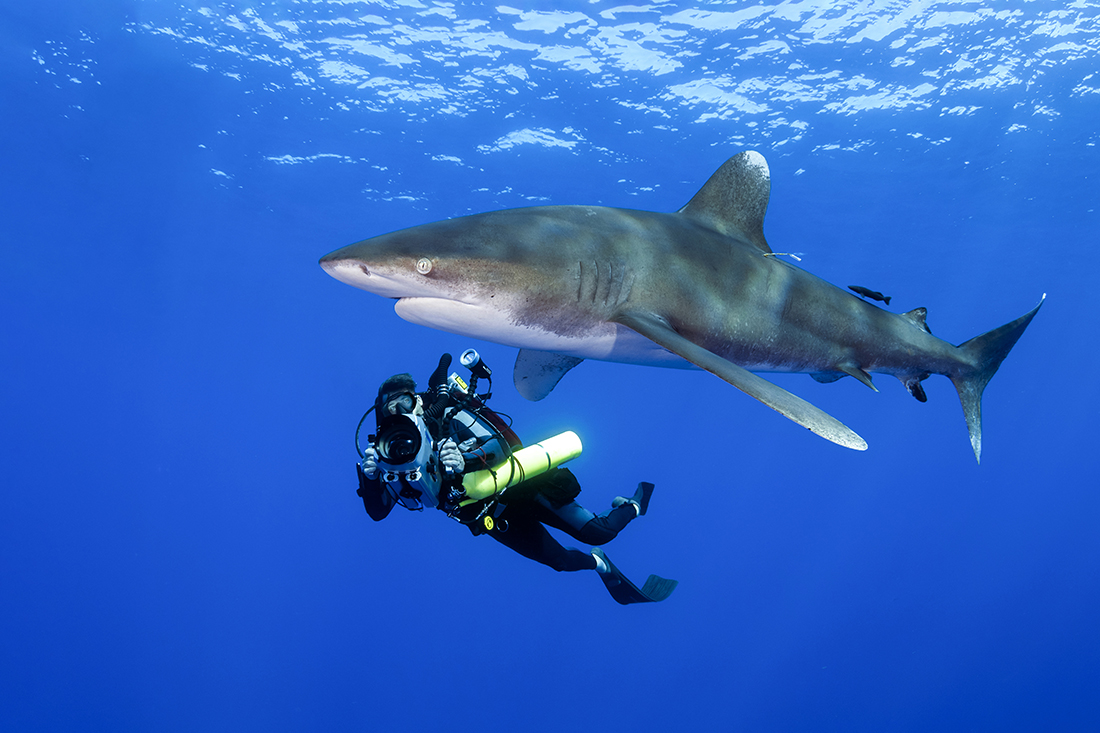
This diver with a large Oceanic whitetip shark demonstrates the interplay between Positive Space, Negative Space and Active Space, we have the shark as the primary subject taking up Positive Space of the image with a diver just beyond it. Surrounding the two, the image contains plenty of Negative Space to provide a state of presence to where this is taking place. To enrich the narrative further, both subjects are offset more to one side leaving additional space in front of the shark. This way, the viewer’s eyes are guided in the direction the shark is traveling thereby suggesting the image is active.
As the adage goes, sometimes “less is more” in the composition of an image. Hopefully you’ve gained a better understanding into the mechanics of Negative Space as well as Active Space. By implementing into your own photographic process, you will develop a greater mastery to both the Rule of Thirds and the Rule of Space.
A version of this article was originally written for Scuba Diver Magazine’s North America Edition issue #22.